
Examples of NMP student maps
Since the Spring 2015 academic semester, the New Maps Plus program has taught students with no prior computer programming background the skill set needed to produce interactive, thematic maps using the Leaflet.js/Mapbox.js libraries and APIs. The following maps were produced as final projects by students within these courses.
Students learned to use the distributed version control system hosted by GitHub to backup and share their JavaScript, HTML, and CSS code. They also developed online portfolios within these courses to showcase what they learned during the challenging, yet rewarding, program.
PATTERNS OF DESTRUCTION: A CENTURY OF WILDFIRES IN THE UNITED STATES
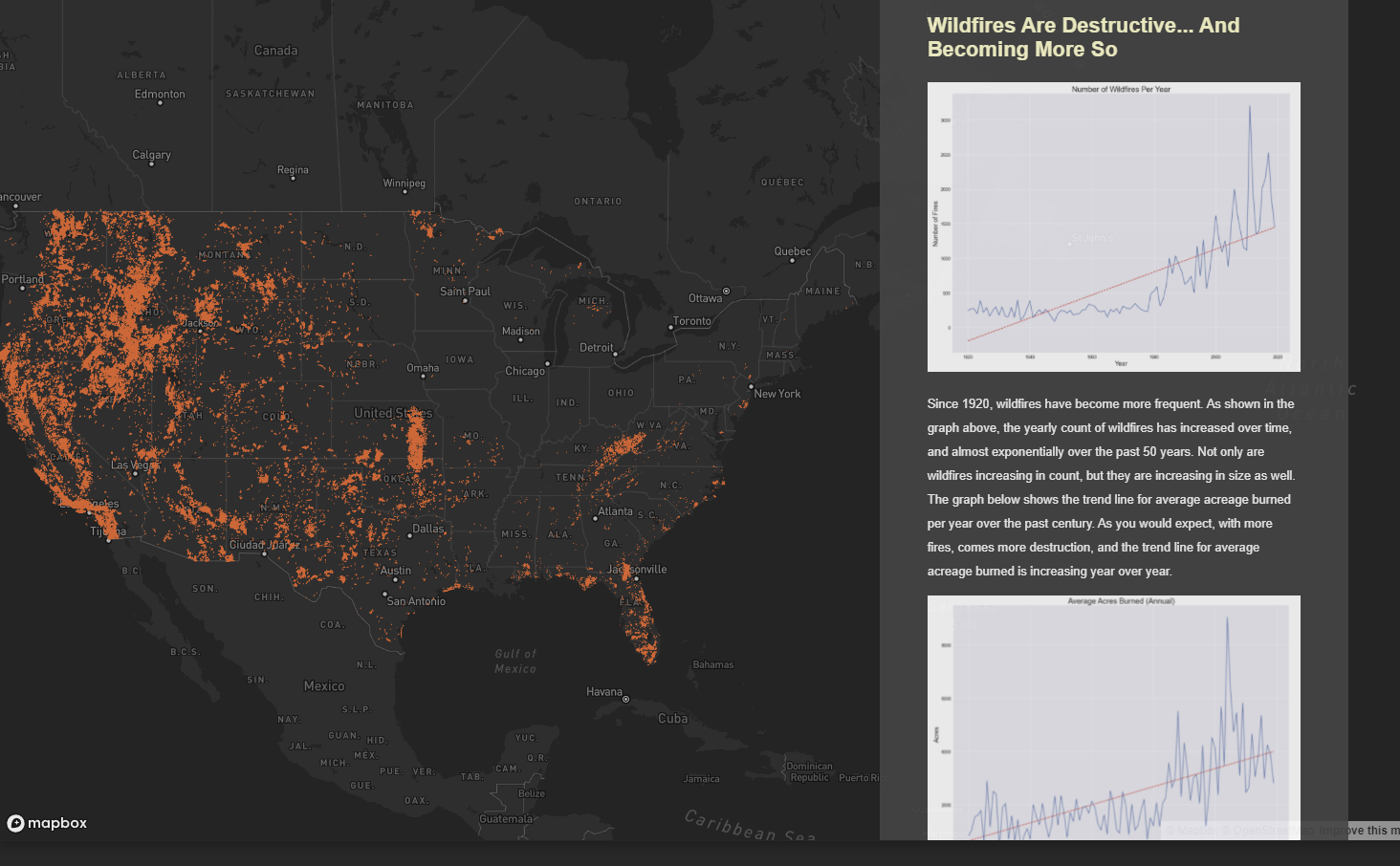 Wildfires are becoming more destructive. Data show an increasing trend in acreage burned per year. This project serves as an educational tool to the large section of our population that is not affected first-hand by these destructive forces.
- Map designed and developed by Alexander Buck.
- See a live version of the Patterns of Destruction map
- His code is hosted on GitHub at https://github.com/AlexBuck328/wildfires
OUR VANISHING GLACIERS: VISUALIZING A HALF-CENTURY OF GLACIER LOSS IN GLACIER NATIONAL PARK, MONTANA
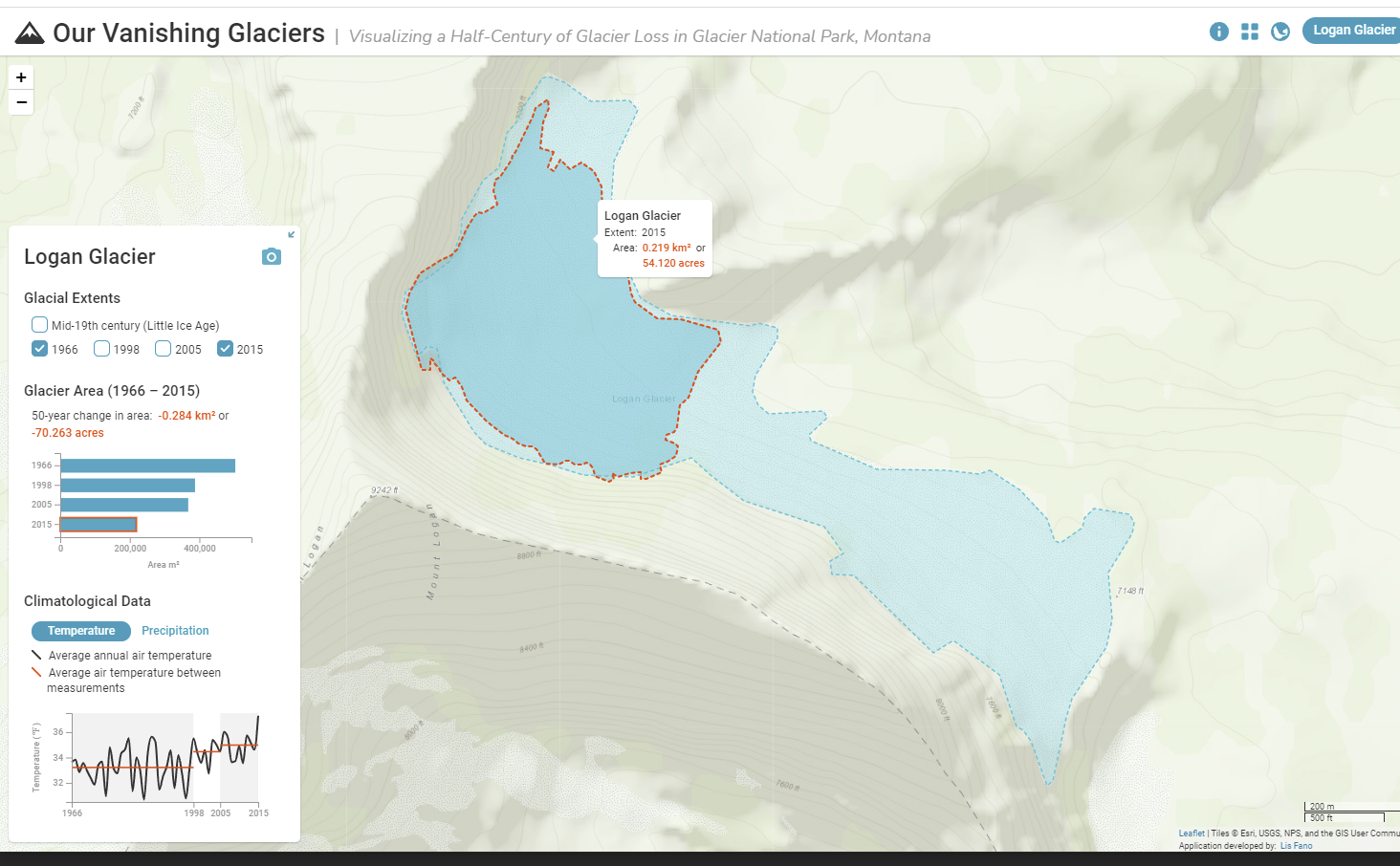 Over 150 alpine glaciers existed in Glacier National Park, Montana (NPS) at the end of the Little Ice Age. In 1966, the park had 35 named glaciers large enough to be considered active. By 2015, only 26 of those glaciers remained. The application is designed to provide an interactive web experience that visualizes the decrease in glacier extent over time.
- Map designed and developed by Lis Fano.
- See a live version of the Our Vanishing Glaciers map
- Her code is hosted on GitHub at https://github.com/efano/GNP-glaciers/
- WINNER (tie) of the 2020 NACIS Individual Student Dynamic Mapping Competition!
EXPLORING INDUSTRIAL POLLUTION IN THE US
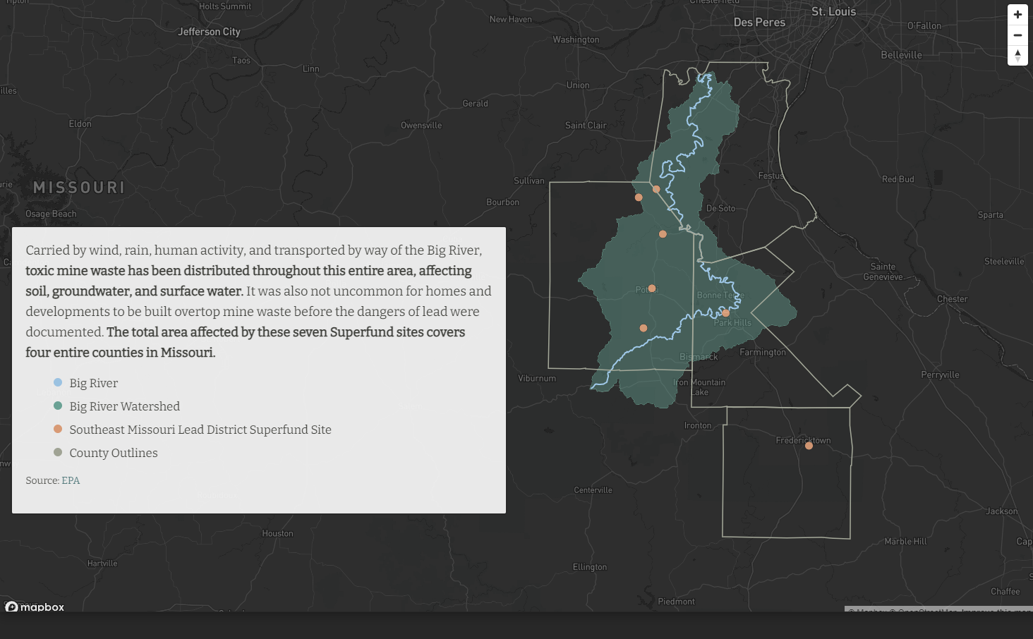 This mapping project is a directed narrative told through a storytelling map format that visualizes the general location and distribution of Superfund sites and TRI reporting facilities. The user is then guided through several case studies augmented with additional data sources that explore the wider reach and context of these sites.
- Map designed and developed by Eileen Grady.
- See a live version of the Industrial Pollution map
- Her code is hosted on GitHub at https://github.com/EileenGrady/us-industrial-pollution
GOING THE DISTANCE
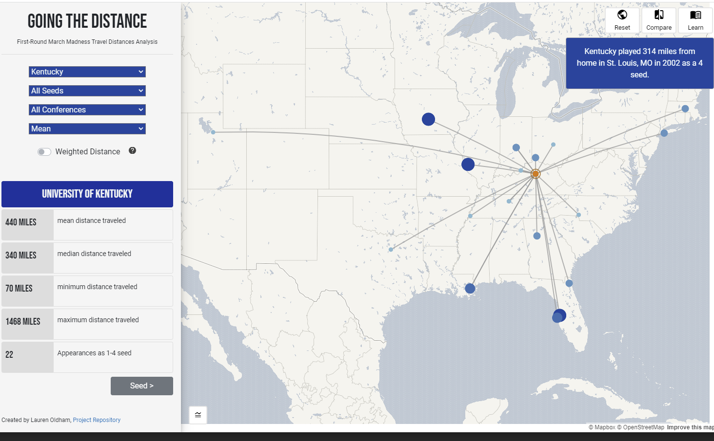 Every year in March, college basketball fans anxiously await Selection Sunday to see if their team made the NCAA Men’s Basketball National Championship tournament, affectionately referred to as March Madness. Many considerations go into the creation of March Madness brackets, but the idea is that higher seeds are rewarded for their regular season performance by playing against the lowest ranked teams. Additionally, the selection committee is supposed to give top ranked teams geographic preference in their first round sites. In this project, I test the claim that higher ranked/seeded teams are given geographic preference over lower ranked teams during the first tournament rounds of March Madness from 1985 to 2019.
- Map designed and developed by Lauren Jaromczyk (formerly Oldham).
- See a live version of the Going the Distance map
- Her code is hosted on GitHub at https://github.com/laurenoldham1202/mens-college-basketball
THE GEOGRAPHY OF PUBLIC DOMAIN OBJECTS AT THE METROPOLITAN MUSEUM OF ART
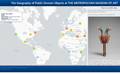 Imagine having access to a world-class collection of art and antiquities at your fingertips, available for your viewing pleasure at any time. This map, created using the documentation made available by the Metropolitan Museum of Art, uses the world-wide locations of the artworks’ origination, and allows the geographic information to be cohesively visualized.
- Map designed and developed by Sharon Wohlgemuth.
- See a live version of the METMOA Public Domain Objects map
- Her code is hosted on GitHub at https://github.com/digitalfootprints/artmap
WATER RECLAMATION PROJECTS& BIODIVERSITY
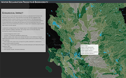 This map seeks to explore a possible relationship between water reclamation projects and biodiversity in western watersheds. There is an overwhelming amount of data and a lot of confusing measurements that federal agencies use to track the health of the environment. My goal is to create a compelling story map that helps users understand a geographic feature (watersheds) that regulatory agencies (like the EPA) use to organize information about water.
- Map designed and developed by Andrea Parr.
- See a live version of the Watershed Diversity map
- Her code is hosted on GitHub at https://github.com/andreaparr/watersheds-biodiversity
LEXINGTON, KY FOODSCAPE MAPPING PROJECT
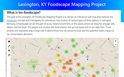 The goal of the Lexington, KY Foodscape Mapping Project is to design an interactive web map that explores the foodscape concept and investigates the prevalence and location of various types of food options in Lexington, Kentucky. Map users will gain a better understanding of how the factors of access/mobility, affordability, time, and general knowledge of healthy eating guidelines impact their interactions with their foodscape.
- Map designed and developed by Lee Moser.
- See a live version of the Lexington Foodscape map
- His code is hosted on GitHub at https://github.com/ljmoser83/lex-foodscape
THE SPOKEN WORLD
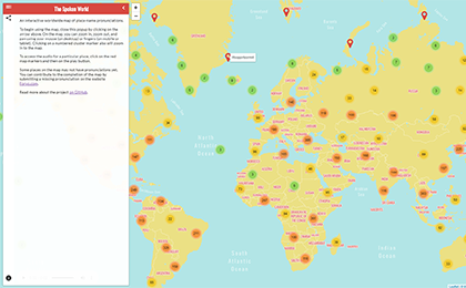 An interactive worldwide map of place-name pronunciations. On the map, you can zoom in, zoom out, and pan using your mouse (on desktop) or fingers (on mobile or tablet). To access the audio for a particular place, click on the red map markers and then on the play button.
- Map designed and developed by Michael McNeil.
- See a live version of the Spoken World map
- His code is hosted on GitHub at https://github.com/mikus31/the-spoken-world
CONSERVATION AREAS IN SOUTH AMERICA
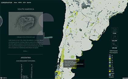 South America is one of the richest sub-continents in terms of cultural and biological diversity; including indigenous people with strong historical ties to the region's ecosystems. Protected and conserved areas have long been a successful management tool to conserve biodiversity, and without them, the global loss of biodiversity would likely be even greater.
- Map designed and developed by Maria Horn.
- See a live version of the South America Conservation map
- Her code is hosted on GitHub at https://github.com/mahorn/conservation
- WINNER of the 2019 NACIS Dynamic Mapping Competition!
OIL & BONE: AMERICAN PORTS IN THE GOLDEN AGE OF YANKEE WHALING
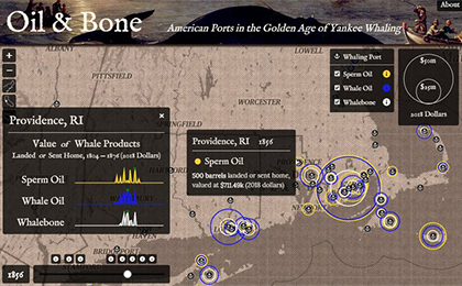 This map was produced with quantitative data on sperm oil, whale oil, and whalebone arriving in port and aggregated from the American Offshore Whaling Voyages Database, created by the World Whaling History Project and hosted online at whalinghistory.org.
- Map designed and developed by Kerry Gathers.
- See a live version of the Oil & Bone Whaling map
- His code is hosted on GitHub at https://github.com/kerrygathers/oil-and-bone
- WINNER of the 2018 NACIS Dynamic Mapping Competition!
SPATIAL PATTERNS IN COMMUTE TO WORKPLACE CENSUS DATA
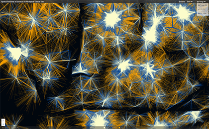 This map was created with census LEHD Origin-Destination Emplyment Statistics (LODES) data that was processed and assimilated into geospatial files using Python. The geospatial data is transitioned into vector tiles using Tippecanoe. The tiles are stored on Mapbox. Leaflet is the main driver of the map utilizing Leaflet Vectorgrid to display the tile sets stored on Mapbox..
- Map designed and developed by Mark Cruse.
- See a live version of the Spatial Commuting Patterns map
- His code is hosted on GitHub at https://github.com/MarkCruse/commute-patterns
AMERICAN NAMES OF THE LAST CENTURY (1910-2016)
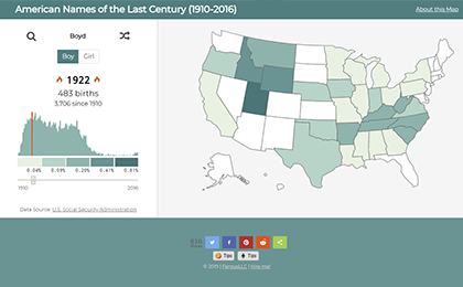 This map was created as a final project for MAP 673 – Design for Interactive Web Mapping in the The New Maps Plus Graduate Certificate in Digital Mapping Program at the University of Kentucky. Much thanks to @rgdonohue for many helpful pointers on this project and others. This project was built with data from the U.S. Social Security Administration.
- Map designed and developed by Will Carter.
- See a live version of the American Names map
- His code is hosted on GitHub at https://github.com/FergusDevelopmentLLC/names-map-node
WEST NILE VIRUS AND ST. LOUIS ENCEPHALITIS IN CALIFORNIA (2003-2018)
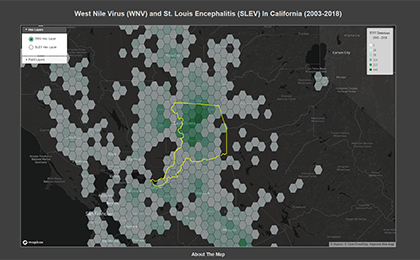 This map shows the distribution of positive detections for West Nile Virus (WNV) and St. Louis Encephalitis Virus (SLEV) for mosquito pool and bird specimens in California between 2003 and 2018 and was created using Mapbox GL JS. Hexbin layers were used to represent both viruses to show density of positive detections in mosquito pool and bird specimens..
- Map designed and developed by Matt Bacinskas.
- See a live version of the WNV & SLEV map
- His code is hosted on GitHub at https://github.com/bazini627/wnvSlevMap
IPHC SETLINE SURVEYS
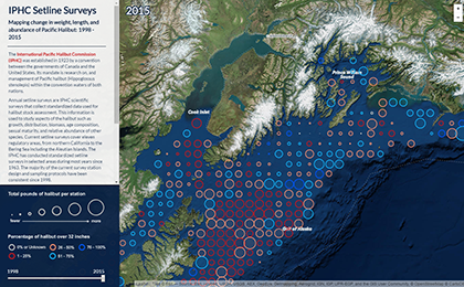 The International Pacific Halibut Commission (IPHC) was established in 1923 by a convention between the governments of Canada and the United States. Its mandate is research on, and management of Pacific halibut (Hippoglossus stenolepis) within the convention waters of both nations. This interactive web map displays the station locations and regulatory areas where the annual setline surveys occur.
- Map designed and developed by Lis Fano.
- See a live version of the IPHC Setline Surveys map
- Her code is hosted on GitHub at https://efano.github.io/
US ECONOMIES 2001 - 2013
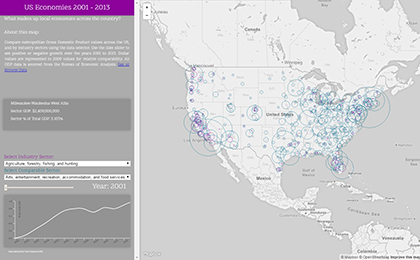 Compare metropolitan Gross Domestic Product values across the US, and by industry sectors using the data selector. Use the date slider to see positive or negative growth over the years 2001 to 2013. Dollar values are represented in 2009 values for relative comparability. All GDP data is sourced from the Bureau of Economic Analysis.
- Map designed and developed by Tyler Hegwood.
- See a live version of the US Economies map
- His code is hosted on GitHub at http://tylerhegwood.com/
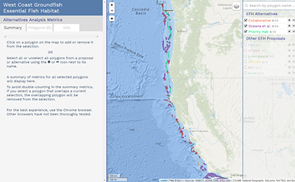
WEST COAST GROUNDFISH ESSENTIAL FISH HABITAT
The Pacific Fishery Management Council (Council) is currently reviewing Groundfish Essential Fish Habitat Conservation Areas (EFHCA) and the Trawl Rockfish Conservation Area (RCA) off the West Coast of the United States. The Council is evaluating alternatives that include areas to be closed to commercial trawl fishing, as well as currently closed areas to be reopened. These areas are referred to as polygons. This tool allows a user to select a custom set of EFHCA alternative polygons and see a summary of the metrics for their set.
- Map designed and developed by Allison Bailey.
- See a live version of the West Coast Fish Habitat map
- Her code is hosted on GitHub at http://cybersea.github.io/
FEDERALLY OWNED LANDS OF THE AMERICAN WEST
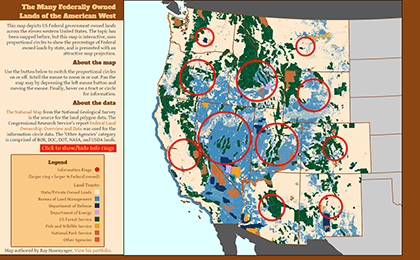 This map depicts US Federal government owned lands across the eleven western United States. The topic has been mapped before, but this map is interactive, uses proportional circles to show the percentage of Federal owned lands by state, and is presented with an attractive map projection.
- Map designed and developed by Ray Hasenyager.
- See a live version of the Federally Owned Lands of the West map
- His code is hosted on GitHub at http://rayhasenyager.github.io/
THE EVOLUTION OF PITTSBURGH'S RIVER BRIDGES
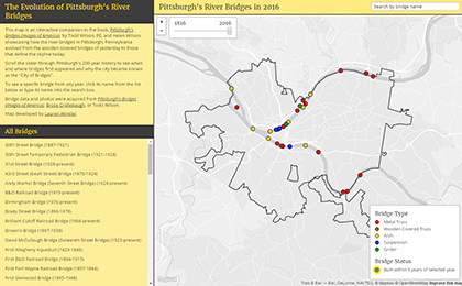 This map is an interactive companion to the book, Pittsburgh's Bridges (Images of America), by Todd Wilson, PE, and Helen Wilson, showcasing how the river bridges in Pittsburgh, Pennsylvania evolved from the wooden covered bridges of yesterday to those that define the skyline today.
- Map designed and developed by Lauren Winkler.
- See a live version of the Pittsburgh River Bridges map
- Her code is hosted on GitHub at http://skeetidot.github.io/
STEP-BY-STEP
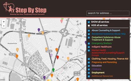 Step-by-Step is a community organization in Lexington focused on connecting young mothers (ages 14-24) to social services. Each service, divided into service categories, is dispalyed on the map and contains a pop-up and info panel displaying address, contact info, website, etc. This map will service Step-by-Step's managing team. The project began January 2015 and will continue development through summer 2015, based on the needs of Step-by-Step.
- Map designed and developed by Laura Greenfield.
- See a live version of the Step-by-Step map
- Her code is hosted on GitHub at https://github.com/lfgreenfield/lfgreenfield.github.io
KENTUCKY TWEETS
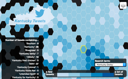 This map uses geocoded tweets to visualize location of Kentucky related social media activity. The chloropleth map compares geotagged twitter data containing: Bourbon, Kentucky, Bluegrass, Kentucky Derby, Hillbilly, Kentucky Fried Chicken, BBN, Kentucky Colonel, Kentucky Kicks Ass, Unbridled Spirit, and Kentucky for Kentucky using hexagon, county, and state polygons.
- Map designed and developed by Anna Lee Bard and Amanda Whitbeck
- See a live version of the Kentucky Tweets map
- Their code is hosted on GitHub at https://github.com/annaleebard and https://github.com/AmandaWitbeck
